Tangle Deck Update

All four 3.5 in. x 5.75 in. decks and
both 2 in. x 2 in. decks are back in stock!

large 3.5 in. x 5.75 in. decks

small 2 in. x 2 in. decks

New to the Tangle Deck Family
Tangle Deck Fragments #1

In their book, Zentangle® Primer Volume 1, Rick Roberts and Maria Thomas, the founders of Zentangle, introduced the concept of Reticula and Fragments. Reticula is another name for a grid or other structure that holds fragments. Fragments are small patterns that you draw within the individual spaces of a reticula (grid). The possibilities are exciting and endless but sometimes hard to visualize in your mind. I began to think of ways to demonstrate the power of fragments.

Note: The following information is excerpted from the companion E-book, ” How To Use Tangle Deck Fragment Cards to Visualize Patterns and Inspire Creativity,” which is included with each deck as a digital download.

Tangle Deck Fragment Cards – The Beginning

To fully understand the possibilities of using fragments, I wanted to have a set of fragment cards that I could play with by rotating and repositioning to help me visualize how fragments relate to each other and, in the process, create a multitude of meta-patterns. Thus, the idea for the Fragment Cards was born. But there are so many different fragment possibilities; where does one start? I have purposely not used the fragments from the Zentangle Primer Volume 1 to demonstrate that you can create and discover fragments on your own. However, I highly recommend the book as a valuable resource.


I decided to take it “one stroke at a time” and start with a simple C-curve that extends diagonally from corner to corner, a quarter circle. All the cards in the first set of Tangle Deck Fragments (Set #1) are based on this simple C-curve.

Different but related fragments are created by adding additional C-curves that still follow the rule of extending diagonally from corner to corner.

Using the Hollibaugh drawing behind technique creates an even wider variety of fragments. Where two C-curves cross, one of the lines stops and disappears as if continuing behind the shape created by the other line, creating an illusion of overlap.

Out of all the numerous possibilities I came up with, I chose ten different fragments to include in the first Tangle Deck Fragments deck. Each of the selected ten fragments has 12 cards, providing 120 cards in each deck. These are not all the possible variations using C-curves, but they are a good variety and enough to create hundreds, if not thousands, of meta-patterns.

The Flip Side

The back of each card has the same fragment as the front, with the addition of a grayscale value in each shape. I used Black, White, and a 50% shade of Gray. When placed in a grid, these cards demonstrate how adding value (or color) can affect the resulting composition’s look. Your eye combines adjacent shapes of the same value into one shape that crosses grid boundaries and redefines meta-patterns. 

So, how do you use Fragment Cards?

  • Play with them as a creativity exercise 
  • Combine fragments to discover different shapes and meta-patterns
  • Create strings and add tangles
  • Create compositions defined by values (or colors) and add tangles

Tangle Deck Fragment Cards #1 has a companion E-book with information on how to use fragments, four exercises to get you going,  and inspiring examples.

I hope you try them and let me know what you think.

Blessings,

Lynn : )


My Tangled Floor Cloth Project

Recently I posted on Facebook about my Tangled Floor Cloth Project, and many people were interested in the materials I used and the process of making the floor cloth. The story is a little long for a Facebook post, so I’ve written a blog about it.

I have been intrigued by floor cloths for some time. I spend a week each summer at an Art Camp where you bring your own projects, and each year I try to bring something I have never done before. This confluence of interests and events seemed the perfect opportunity to tackle creating a floor cloth. I currently don’t have the space to work on a project this size at home, so taking advantage of the space provided at camp seemed like a great idea.

Materials:

The material was a bit of an experiment. I got a 5′ x’ 5′ remnant at a local non-profit textile recycling shop called the Ragfinery for $5. It was not the usual numbered cotton duck used for floor cloths but was, I believe, a material used either for upholstery or awnings. It was a heavier synthetic material with a vinyl coating on one side, but it still had a woven texture and lay flat on the floor, so I tried it.

The cloth I bought was wine-red, but I put a coat of white primer on it, so the color didn’t matter. I bought some recycled latex paint at the local Habitat for Humanity store for the base color of the cloth (green). I planned to put this cloth in my kitchen when it was finished, and I had a turquoise paint sample that matched the kitchen walls, so I added that to my painting supplies. I dug out various acrylic paints and paint pens I already had for additional accent colors. I also selected several brushes from what I already had on hand. I experimented with different ways to add shading details, and in the end, I used Faber-Castell Pitt pastel pencils and Pan Pastels (more about that later). I bought a quart of triple thick matte finish Polyurethane to seal and protect the cloth when I was done painting it.

Process:

I cut the cloth from 5′ x 5′ down to 3′ x 5′. The 2′ x 5′ off-cut gave me some cloth to experiment with when deciding on colors and technique.

After painting the cloth with a white primer that promised to stick to practically anything (remember it was already coated with vinyl), I taped off the border area and created the background. It turned out that the color of the green paint I bought wasn’t exactly what I wanted, so I added some of the acrylic paint I had to create a color I liked. I wanted a simple and quick technique for the background because I wanted to spend most of my time on the border. What I came up with was to paint a section with green paint, then go over it with a smaller brush using a swirling movement. This was quick and gave a mottled swirly effect that was interesting but subtle enough to let the border graphics take center stage.

I had a vague idea of the design for the border, and I knew I wanted to use an alternating-color Knightsbridge-ish pattern somewhere. I decided to add a border that alternated white and turquoise in a thin stripe around the outside and inside of the main border area. I was getting some leakage under the painter’s tape, and it was at this point I remembered the trick of laying down the tape and then painting over the edges with a clear acrylic medium to seal the edges. Worked like a charm. Once this narrow border was completed, I used a brush to fill in the main border area with green.

Now came the tricky part, laying out the border elements. I measured the length and width of the border and calculated a measurement for the large Mooka I thought would work as a repeat element around the border. Never having tangled this large before, I was a little unsure of myself, so I cut out a paper template and did a test layout to see if it would work, and it did! I then transferred the template onto some stencil material. I used this stencil to draw the large Mookas around the border. Once these were placed, I filled in the remaining elements freehand. All this was done using a pencil.

To define the border elements, I painted around them with a darker color. I created this color by mixing dark blueish-green and purple acrylic paints. This resulted in a dark blueish color.


Once the dark background of the border was complete, I felt like the design needed more of the turquoise color to tie the cloth to the turquoise wall of the kitchen, so I painted all of the Damsel Leaf turquoise.

Now came the shading of elements. I have to admit I am not an experienced painter. I tried several techniques for adding shading but didn’t like the results. I often use pastel pencils to add colored shading to my Zentangle tiles, and I wanted something similar to that process. I decided to experiment with my Pan Pastels. After all, they call them pastel PAINTINGS, don’t they? I did some tests applying the Pan Pastels with the sponge applicators, then blended them with some large tortillons. This worked incredibly well, as the pastels stained the underlying paint. I was even able to make some adjustments with an eraser. This worked for everything but the white highlight. I ended up using a white paint pen along the edges and spraying the white highlights with acrylic sealer. I knew the pastels would be fine when I added the polyurethane because I wiped the cloth with a wet sponge, and the pastel colors didn’t diminish at all. This was an experiment that was very successful. I also wanted to mention that I used the same blue-ish green and purple colors for the shading that I used to mix the dark blue background. This resulted in a very harmonious color palette.

I should mention the books I read and the videos I watched all recommended that you hem the cloth before any painting is done. I did not have the opportunity to do this before I left for art camp, so I waited until the cloth was completely painted, and I had no problems doing it this way. I used my early 1990s-era Bernina (inherited from my Mom) with a leather needle. I finished the cloth with three coats of triple-thick outdoor-rated polyurethane.

I am so happy with the final outcome, even though I deviated from some of the standard procedures recommended for floor cloths. My first attempt at making a floor cloth turned out beautifully; it lays flat on the floor, is flexible, and I love seeing it when I walk into my kitchen. Many have said they would find it hard to walk on. My response to that is, do you feel the same way about walking on a specially designed area rug? Rugs are meant to be walked on, and so are floor cloths.

I hope you enjoyed this telling of my floor cloth journey and are inspired to try something similar. I think my next “big” project will be a table runner.

As always,

Blessings,

Lynn


Tree of Life Labyrinth

Recently I wanted to draw a freehand labyrinth. I like the quality of a simple freehand labyrinth and had used the “connect the dot” method in the past starting with a cross in the center. I tried to recreate that version but found that I couldn’t remember exactly how I had done it before. As I was trying to figure it out I stumbled on to this variation that turns out to be very similar, but starts out a little differently. To me it resembles a tree, so I have decided to call it the Tree of Life Labyrinth.

Following is the step-out to create this labyrinth on a 3½ inch tile. As you will see, I have used a numbering system to indicate how to draw the lines. It may seem complicated at first but once you understand the process and draw the labyrinth you will see how naturally it flows from one step to the next until the labyrinth is completed.

STEP 1

Place a dot approximately 1/8 inch to the left of the center of the tile.
Note: placement of this dot will determine where and how your finished labyrinth is placed on the tile.

STEP 1

STEP 2

Place a dot horizontally approximately 3/8 inch to the left and right of the first dot.

STEP 2

STEP 3

Using the same 3/8 inch spacing, add five more dots below the first three dots to create a square.

STEP 3

As a reference for the remaining instructions I am assigning a number, 1 through 8, to each of these dots.

STEP 4

Connect dots 2 and 4 with an inward curved line. Do the same for dots 2 and 5, 4 and 7, and 5 and 7. This will form a curved diamond shape in the center of the square of dots.

STEP 4

STEP 5

You will draw the labyrinth from the center out. Start by drawing an upward curved line connecting dots 2 and 3.

STEP 5

STEP 6

Continue with an upward curved line connecting dot 1 to dot 5. This line should aura the first line keeping the distance between the lines roughly equal. Turning the tile as you draw will help you keep the spacing consistent.

STEP 6

STEP 7

Connect dots 4 and 8 in the same manner.

STEP 7

STEP 8

Continue by connecting dot 6 to dot 7.

STEP 8

STEP 9

Finish by starting at dot 7 and adding a final line around the outside of the labyrinth. Stop at the bottom and add a slight downward curve to create the entrance.

STEP 9

STEP 10

The completed labyrinth is now ready for you to travel to the center and back by adding tangles along the path.

STEP 10

This labyrinth suggests a tree to me so I called it the Tree Of Life Labyrinth and filled it in with tangles accordingly. It was a lovely meditation for me.

Tree of Life Labyrinth

Here is another drawing I made using this labyrinth. Masking fluid was used for the labyrinth with water color marker added over that. When you remove the masking you end up with a white line.

I feel that drawing a labyrinth freehand adds another level to the meditative experience. I hope you give it a try and don’t worry if it is not centered on the paper, that just makes it more interesting.

As usual I encourage you to try anything you see in this blog post in your own work.

Blessings,

Lynn

Threezee – New tangle developed by the CZT crowd

Something interesting happened to me recently. I was busy drawing when an image suddenly popped into my head. It had nothing to do with what I was drawing but it demanded to be put down on paper. This is what it was…

It is a simple motif that is made up of three Zs. This little guy gave me such happy feelings that I did a quick step-out and called it ThreeZee. I didn’t have time to play with ThreeZee right then so I posted it to a CZT page to ask if anyone had seen anything like it or had used the name before.

It was then that a wonderful thing happened. ThreeZee inspired several CZTs to do some explorations and use ThreeZee in some very interesting ways.

First, Marguerite Samama used it as a string on a 3Z tile (how appropriate!)

Tile by Marguerite Samama, CZT

Of course, I had to give that a try too!

I used some of the introductory tangles in honor of the “Z string”.

That made me want to see what kind of meta pattern would be created if I drew it as a fragment in a hexagonal grid. The result was very quilt-like and I had fun adding the tangle Maryhill (by Betsy Wilson, CZT) which gave it real dimension.

Then Jane MacKugler posted a wonderful, colorful, freeform version of ThreeZee. Adding to the basic motif resulted in a meta pattern of stars.

Tile by Jane MacKugler, CZT

Then Diana Schreur, CZT posted another version of this freeform style. She used ThreeZee with her tangle, Connesses, which, similar to ThreeZee, is made up of three Ss. (Step Outs for Conesses can be found on TanglePatterns.com )

Tile by Diana Schruer, CZT

Of course these two tiles inspired me to give this free form style a try too. Also, this question arose, “What do you call a group of ThreeZee? a Cozy of course ; )”

TIP: I did find that it is easier for me to keep track of things when grouping ThreeZee, if I draw the second Z of the motif all the way around to form the star first, and then go back and add the third Z (see illustration below). Also, be mindful that you are drawing a Z and NOT a mirror image.

Use the same method when adding additional ThreeZee to create a grouping.

OR use another form at the intersections of ThreeZee, such as the orbs in this example, and create an even more random grouping.

I call this one “The Soccer/Football Game”

I also played with putting ThreeZee in a circle Reticulum using a curvy Z and some auras. Here is a work in progress drawing so you can see the progression.

Or ThreeZee as a border.

A chorus line of ThreeZee RockettZ

And finally, connecting the “legs” of a ThreeZee motif for an Origami Threezee.

Origami ThreeZee

I just love the way this tangle introduced itself to me and created an environment that inspired others to help develop its potential. Kind of Crowd Sourcing for tangle development or as Rohini Singh, CZT put it recently, I may be ThreeZee’s Mother but Marguerite, Jane, and Diana are the midwives that helped give it birth.

I hope you give ThreeZee a try. As you can see it’s very versatile and I think you will find it will make you happy too. What can be better than that?

Blessings,
Lynn

Inktober in review

Inktober was started in 2009 by Jake Robinson as a way to improve inking skills and develop positive drawing habits. The idea is to make a commitment to do an ink drawing every day in the month of October and then post it online. For the last couple of years the tangling community has embraced Inktober and this year I participated using the prompts by Stephanie Jennifer on the Square One Purely Zentangle Facebook page. Inktober is over but was a great fun. I found it a good exercise to go back and look at what I accomplished during the month and I’ve made a video of my Inktober tiles to share with you.

A couple of these tiles were variations of the original tangle step outs and there was some interest to see how I drew them. It turned out that both the tiles started with 6 lines either crossed or as a hexagon. Here are the 2 tiles and some step outs I created after the fact to re-create how they were drawn. Please feel free to give these a try yourself.

The focus tangle on the first tile I want to share is Hamadox by CZT Diana Schreur. It is a combination of the Tangles Hamail by Tina Hunziker and Paradox by Rick Roberts.

Here’s how Diana combines the two tangles into Hamadox.

Step 1 is to draw the square
Step 2 is to draw shapes in Hamail fashion around the outer edges of the square
Step 3 is to draw Paradox in the interior of the square and add rounding so it matches up with the curve of the outer shapes
Step 4 is to add rounding around the perimeter to blend it all together

I wondered what it would look like if I started with a hexagon instead of a square? The result intensified the spiraling and overlap effect of the tangle. I find it very pleasing.

Following are the steps for my version.

Start by drawing a hexagon shape. Next, begin adding the shapes around the outer perimeter.

Continue adding shapes along each side, gradually reducing the size in Hamail fashion.

Now start adding the paradox to the interior of the hexagon using the same steps as if you were drawing in a triangle or square, starting from the outside and working toward the center. Hint: adding the rounding to each row as you finish it will help you keep track of where you are.

Continue to the center. Note: on my Inktober tile I added an orb in the center instead of continuing the Paradox to the very center. I would recommend this because it is much harder to keep track of where you are the closer you get to the center. The orb allows you to finish off the Paradox before things get too small.

Finish by adding rounding to the outer perimeter. This combines the outer and inner sections together into the completed shape. Add shading as desired.

The other tile I want to share uses Cross-Ur-Heart by Jenna Black as the focus tangle. Here’s how Jenna draws her tangle.

Step 1 – draw crossed lines
Step 2 – connect the ends to form 4 heart shapes
Step 3 – add “petal” shapes around the outside
Step 4 – add contour lines to the hearts and petals

I wondered what if I added another line and made all the lines curved instead of straight? The result gave the drawing a sense of movement and life.

Here are the steps I took to create this tile.

Step 1 – I added an additional line to the crossed lines creating 6 sections instead of just 4. I also added a curve instead of making them straight.
Step 2 – Same as in original step out, connect the lines to create hearts. I ended up with 6.
Step 3 – I added orbs with petals around them only to the intersections of the hearts. I added a looped shape from the center point of each heart up to the outer point to add a little interest and to create a reference for adding the contour lines.
Step 4 – To finish I added the contour lines, embellished the outer petals and added shading.

I love the way making a minor change to the basic step outs on both of these tiles created a whole new look for each of these tangles. Please feel free to try out my “What If” ideas or better yet try out some “What If” ideas of your own.

Blessings,

Lynn

The Golden Spiral

Did you miss me? I know my tangler’s mind hasn’t shared much so far this year, but all I can say is life happens, and once you get out of the habit of posting, it’s hard to start up again. Anyway, here I am, and I’m excited to have something brilliant to share with you.

Around the middle of June this year, Pilar Pulido, a CZT from Madrid, Spain, contacted me. She was developing a class that was to be presented at the European CZT Gathering in September and wanted to know if I’d like to collaborate with her. The class she proposed appealed to my tangler’s mind, so of course, I said yes, and our trans-Atlantic collaboration began (me in Monroe, WA, U.S.A, and Pilar in Madrid, Spain). Pilar had an idea to use math to describe tangle strings, and we decided to focus on Fibonacci numbers and the Golden Ratio.

It was great fun to collaborate with another CZT nine time zones away. At first, we just emailed. Then we switched to Messenger and DropBox. Finally, towards the end, we made calls over the internet. We just had to remember to schedule meetings when the time was convenient for both of us. In the end, we were both really happy with the class and Pilar presented it last month at the European CZT Gathering in Cork, Ireland where it was well received.

Here are some highlights:


Pilar teaching the class in Cork

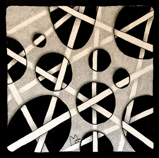
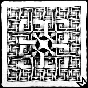
class mosaic and samples

After the great response to this class we decided to share the class content with the rest of the Zentangle community, so here is a summary of the class and a link at the end to the class handout. Enjoy!

Math Strings: Fibonacci Numbers, the Golden Ratio, and the Golden Spiral

What is it about some objects that make them aesthetically pleasing? It is thought one answer to this question is the Golden Ratio, also known as Phi and represented by the Greek letter Φ. The Golden Ratio is a mathematical relationship that exists in art, shapes, nature, and patterns. This ratio is 1 to 1.618 (rounded).

One cannot talk about the Golden Ratio without also mentioning the Fibonacci sequence. What is the Fibonacci sequence? It is a sequence of numbers where each number in the sequence is the sum of the previous two.

1+1=2, 2+1=3, 3+2=5, 5+3=8, 8+5=13… OR  2, 3, 5, 8, 13, 21, 34, 55, 89, 144…

The relationship of each number to the next number in the sequence is a very close approximation of the Golden Ratio.

The Fibonacci sequence and the Golden Ratio are evident all around you from the microscopic to the macroscopic (see the link at the end of this blog for examples). Here is one example you can try yourself. Hold out your first finger. Note that the length of the first and second bones added together equals the length of the third. 1+2=3 seem familiar?

This length relationship (ratio) allows your fingers to fold into a compact spiral to form a fist.

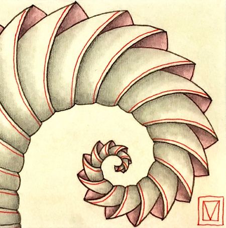
The Golden Ratio is also used in defining a Golden Rectangle and a Golden Spiral.

The length of each side of a Golden Rectangle is determined according to the Golden Ratio. The ratio of the shorter side to the longer side is 1 to 1.618. If you define the largest square possible inside a golden rectangle, what is left over is a smaller golden rectangle. This process can be repeated with each golden rectangle, and each square maintains the golden ratio to the previous square. Adding a quarter arc to each square results in a Golden Spiral.

The Golden Ratio, along with other maths, seems to be important in defining the framework of our universe or, to put it in Zentangle terms, “the strings” that determine how some things look and act. We are not always aware of their existence because, like the strings on a Zentangle tile, they disappear beneath the surface, but they are there, and they beautifully demonstrate the Zentangle concept of the “elegance of limits.”

It is the Golden Spiral we have chosen as our “math string” for the class project.

Note the class handout goes into a little more detailed explanation of the Golden Ratio, Golden Rectangle, Golden Spiral, and Fibonacci numbers, and I’ve provided some links to some fun and interesting information that can be found on the web. You will not be required to do any math to create this project, there is no test!

A word about the paper used in the class.

Part of what makes this class work is the paper. The paper is Fabriano Pergamon, weight: 230g/m², color: ivory. It is a semi-translucent parchment with a textured surface that provides just the right combination of opacity and translucence for this project. And yes, this paper is made by the same company that manufactures the Fabriano Tiepolo paper used for official Zentangle® tiles.

UPDATE Aug. 14, 2022: BREAKING NEWS! If you live in Europe, Pilar is selling these special Pergamon tiles on her site, Zentrarte, in both colors, natural and white. Here’s the link to her store:
https://zentrarte.es/producto/inspiring-tiles-square-pergamon/

NOTE: Here’s the good news, it’s available in Europe and Canada (happy face.) Here’s the bad news, we have been unable to find a source in the United States (sad face.) I’m not sure of its availability in other countries; I think it is also available in Australia. I am still searching for a source or an alternative in the U.S. If you happen to find a source, please let me know (Please Note I’ve already contacted the company Fabriano lists on their site).

PAPER UPDATE: I have located an excellent substitute for the Fabriano Pergamon Parchment. Here are the details:
Fedrigoni Pergamenata Parchment (manufactured in Italy)
Weight: 230gsm (85 lb. cover)
Color: Ivory (or natural) also comes in white

U.S. Links for ordering 27” x 39” sheets:
Dolphin Papers
John Neal Bookseller

U.S. Link for ordering 8.5” x 11” sheets:
Amazon

UPDATE Aug.14, 2022:  Apparently, this paper is not currently available through Amazon US. Try the following link instead.
Natural color
https://www.cardstock-warehouse.com/products/natural-pergamenata-parchment-cardstock-paper?pr_prod_strat=description&pr_rec_id=a4da600ef&pr_rec_pid=8533439809&pr_ref_pid=8533435649&pr_seq=uniform&variant=31958516531245

White color
https://www.cardstock-warehouse.com/products/white-bianco-pergamenata-parchment-cardstock-paper?variant=31958516727853

UPDATE Aug.14, 2022: Thanks to all those who have provided additional links for Pergamon or Pergamonata paper in other locations: I will update this list when I get additional information.

AUSTRALIA:
https://www.amazon.com.au/Parchment-Paper-PERGAMENATA-Cardstock-Warehouse/dp/B01N43Z0ZQ

CANADA
https://www.deserres.ca/products/fabriano-pergamon-parchment-paper?variant=39362001338501

GERMANY
https://www.gerstaecker.ch/FABRIANO-Pergamentpapier.html?gclid=Cj0KCQjwuuKXBhCRARIsAC-gM0jl92EKZTyVhuAO_DUvfJ0IhbMAWsO8rsaP4QMoy6ffpgIhCuhFggIaAu36EALw_wcB

SLOVENIA
https://fabriano.com/en/product/pergamon/

UK
https://www.greatart.co.uk/fabriano-pergamon-paper.html

US
https://www.talasonline.com/Pergamenata-Parchment-Paper


I should also mention that I heard Fabriano is discontinuing the Pergamon but have not been able to verify. However, I believe the Pergamenata is also available in Europe and Canada.
UPDATE Aug.14, 2022: Verified that the Fabriano Pergamon is still available.


The class handout provides templates of the golden spiral going in both directions, and because of the translucence of the Pergamon paper, you can lay it over the template and use it like a pre-strung tile.

Pergamon paper taped over the template.

Phicops – the main tangle


We chose to use the tangle Phicops for our Golden Spiral project because it works so well on the spiral and has a connection to the Golden Ratio. It is by Laura (The Diva) Harm’s husband, B-rad. The story of Phicops, its step out, and its connection to the golden ratio can be found on Laura’s blog here.

Directions for drawing Phicops using the Golden Spiral Template can be found in the Class Handout.

Of course, you can use other tangles with the Golden Spiral too. Here are some examples of other tangled spirals using Molygon, Echoism, and Paradox.

Using Molygon and Echoism in a double spiral.

Using Paradox on a single spiral.

But wait, there’s more! Now for the surprise…
One of the reasons the Fabriano Pergamon paper was chosen for this project is its combination of opacity and translucence. In addition to the ability to see the template and use that as a string, one is also able to add color and pattern on the back. It will be barely noticeable from the front in normal light but magic happens when you view the drawing lighted from the back.

Here’s an example of what I mean.

Phicops embellished with Onamato and color.
Note the subtle Sandswirl in the background done in white gel pen.

Color was added to the back side of the drawing.
Note: it is barely noticeable in normal light when
viewed from the front (see above)


When backlit, the added color on the back is visible, and
the gel pen, since it is opaque ink, appears as a grey line.

Here are two more examples from the class in Cork. Thanks to Marguerite Samama and Joanna Quincey for giving permission to show their work here.

Joanna Quincey’s drawing in normal light (on top)
The color detail and added tangles are revealed when backlit (on the bottom)


Margurite Samama’s drawing in normal light (on top)
The tangle details are revealed when backlit (on the bottom)
Note also her variation of Phicops.

We hope you’ll download the Class Handout and give our project a try (even though you may have to find a substitute for the paper.) We have decided to offer the handout for free, but if you’d like to help us defray the costs of developing the class and providing the download, you can send us a donation through PayPal to lynn@atanglersmind.com (here’s a link that explains how to do that.)

Click on the link below to download the class handout PDF. You will need to know how to save a PDF from your browser and operating system. (Note: this pdf has been formatted to print on both Letter and A4 size paper)

MathStrings-The Golden Ratio

Finally, as promised, here are some links to interesting websites and fun YouTube videos about Fibonacci numbers and the Golden Ratio.

https://www.mathsisfun.com/numbers/nature-golden-ratio-fibonacci.html
This site has a fun interactive demonstration of how the Fibonacci sequence and the golden ratio help plants to pack the maximum number of seeds into their seed heads.

https://io9.gizmodo.com/5985588/15-uncanny-examples-of-the-golden-ratio-in-nature
This site has examples of the Fibonacci sequence and the golden ratio in nature.

https://www.youtube.com/watch?v=ahXIMUkSXX0
https://www.youtube.com/watch?v=lOIP_Z_-0Hs
Fun YouTube videos about the Fibonacci numbers and plants.

Give this project a try, and we guarantee you will create a drawing of divine proportions!

Blessings,

Lynn and Pilar

Dorian’s Star

This year I’ve been participating in the 12 days of Zentangle, a series of projects presented by Rick, Maria, Molly and Martha from Zentangle HQ. They have thoughtfully provided a project pack with all the supplies needed to follow along with the YouTube videos they have posted. Project Pack 02 can be purchased from their web site, however, you can also choose to use what supplies you have on hand, which is what I decided to do. The day 7 project makes use of a pre-strung Zendala so off I went in search of my pre-strung Zendalas. Well I couldn’t find them anywhere but I did run across a pattern I had printed for a 3D star that was posted last year by Dorian Eng, CZT. I could see that it could easily be substituted for the Zendala used in the day 7 project. Well the resulting 3D star has received a lot of attention and many people have asked for the instructions for making it, thus this post.

Dorian has graciously given permission to duplicate her pattern and provide it to you. I’ve created a PDF with two sizes that you can download from this link DorianEng-3D-Star. (Note: it will open in your browser and you can save or print from there.) They are designed to be printed on 8.5 x 11 paper. I recommend a heavier weight paper, at least 60 or 70 pound, but not too heavy or it will be hard to fold.

UPDATE: Apparently this PDF is not displaying or printing correctly in some browsers (Firefox). A temporary fix for this issue is to view the file from another browser or download the file and view and print it that way. I’m pretty sure I can fix the file but will not be able to fix it till after Christmas.

UPDATE: The PDF has been fixed so that you can now view it using the FireFox browser.

So here are the steps to create these stars:

  • Print the size star you want on a heavier weight paper and then cut it out along the solid lines. Don’t forget to cut the 5 outer diamond shapes in half along the central line.

  • I found that it is much easier to fold the star shape if you score all the lines. To do this you will need some kind of scoring tool. Here are a couple of examples:

Anything with a fairly narrow blunt point will work.

  • Using a straight edge I scored along all the printed lines.

  • Next I folded back and forth along each scored line in both directions, with the exception of the small central star.

  • For the small central star flip the paper so that the printed lines are to the back. Then carefully fold along the scored lines that outline the small star so that they are a mountain fold.

  • I drew my tangles on the unprinted side. You can see the basic shapes where the tangles go as defined by the folds. I drew over the folds to further define the sections.

  • I further broke down the larger sections into three smaller ones.

  • This is the point where I added my tangles. You can use any tangle you want to fill in the star. I followed the instructions from the day 7 video to add my tangles. Here is a link to the video. If you haven’t seen it I encourage you to watch it, you might recognize the interweaving of auras as the same technique used in my tangle Fassettoo.

I used two colors of blue micron and gold Gellyroll.

  • To make the star 3D fold as indicated on the printed template. You can finish the star in two ways.

Fold the outside sections back under each arm of the star and glue.

Or overlap the outside sections and glue to form a pentagon shape.

  • Here’s my final star. I chose the second option. I like the way the gold accented the large star shape and complemented the small inner star.

Hope you all have fun with this and thanks again to Dorian for sharing.

Blessings and Happy Holidays,

Lynn

TransluZENce

I’ve been wanting to share the technique of TransluZENce and this week’s Square One Purely Zentangle focus, Membranart by Tomas Padros (step-outs found here), has given me the chance to do so. TransluZENce is a cousin to TranZENding, a technique recently introduced in a Kitchen Table Tangles (KTT) video by Rick and Maria on the Zentangle Mosaic app. While TranZENding is based on drawing one tangle on top of another and then using white to highlight and graphite to shade, TransluZENce is based on drawing behind and then using graphite to make it look like you are viewing the background through a translucent media like tissue paper or frosted glass.

I decided to create an example using Membranart and Hollibaugh as everyone is familiar with the draw behind aspect of Hollibaugh. Instead of Membranart appearing opaque it appears translucent, giving a glimps of what lays behind.

Here is how this illusion is created…

With your pen, start Membranart as normal.

Again with your pen and using the principle of drawing behind add Hollibaugh in the background.

Using a pencil on top of Membranart, connect up the lines of Hollibaugh that would normally be hidden.

Using your pen, fill black in the areas between the Hollibaugh lines in the background.

NOTE: this technique will be more effective if you use high contrast tangles in the background.

Now, to make Membranart look translucent, use your pencil to lightly and evenly add graphite to the spaces between Hollibaugh on top of Membranart. Smooth out the graphite using a tortillon or paper stump.

Finish the tile with shading to create 3D and layering effects.

Here is another example using Membranart (makes me think of something spilled on the kitchen floor.

And another example I did using Puffin and Showgirl back in June, 2017.

As is usual, if you would like to try anything in this post in your own work please feel free to do so. If you post your work, please use the hashtags #transluzence or #transluzent where they are allowed and let people know about this post. Many thanks.


Blessings,

Lynn


haKrall and Friends – Building Bridges

I recently created this tile for the Square One Purely Zentangle Facebook page. The focus tangle was haKrall (deconstructed by Holly Atwater, stepouts here) and I paired it with Stoic (Zentangle®, AKA Twile, stepouts here) and B’Twined (deconstructed by Pegi Schargel, stepouts here). This tile was a real meditation for me and it turned out to be a sort of square zendala with a maze-like feel to it.

I had several people ask if I had work-in-progress photos of this tile so they could see how the tile developed. I have to admit, I was so absorbed in the zen of this tile that I did not even think to stop and take photos as it developed. However, thanks to some digital magic I have created some graphics that will help to explain the process.

This tile was started with a simple pencil string grid, 6 squares by 6 squares, recreated here in red.

This layout can be broken down into three rings (for lack of a better word, square rings? oh well) starting from the outside perimeter and working toward the center. One for each of the three tangles I’d chosen.

Stoic on the outside ring

haKrall on the middle ring

and B’Twined in the center

As you can see from these graphics each tangle is simply drawn on one of these three concentric rings. The magic happens for this tile because there is a relationship between these tangles. Both Stoic and haKrall have the center square with arms radiating around in slightly different ways. All three are really fragments that when put together on a grid have an over and under woven appearance.

These tangles work so well together on this tile because connections or as I like to call them BRIDGES are created between the tangles. To create the bridges I was mindful of two things as I was drawing, proportion and orientation.

The parts of each tangle that connect with the tangle in the adjacent sections need to be roughly the same dimension.

The tangles in each section needed to be oriented correctly to align with the tangles in the other sections.

This is not as difficult as it may look or sound. You just start with one tangle. I started with stoic around the outside. When you start the next tangle in the next section it will be obvious how to orient it to match up with the adjacent section and the proportion it needs to be so that a bridge is created. Visualize extending lines from the first tangle into the next tangle. Just work slowly and mindfully.

The point here is that nothing special was done to these tangles to get them to flow together, it is simply a matter of being mindful of their similarities and how they can form connections. In fact there’s a good chance you have already done this on some of your own tiles.

I also feel this is a good life lesson too. We would all be better off if we were more mindful of our similarities and used them to forge connections. Something to think about anyway.

As always if there is anything in this post that you would like to try in your own work please feel free to do so.

Blessings,

Lynn


How do I finish this tile?

I recently asked some of my fellow CZTs to send me photos of tiles they had set aside for one reason or another and not finished . I thought it would be fun to finish the tiles and do a blog post to explain why I finished them the way I did. I was hoping to be able to give some insight into some of the roadblocks tanglers face and ways to get past them. I don’t know if I’ve achieved this but many thanks to Certified Zentangle Teachers Jessica Davies, Nancy Domnauer, Tasha Millhouse, and Anoeska Waardenburg for allowing me to give this idea a chance. It was challenging.

I’ll start with this tile sent to me by Tasha Millhouse.

I thought it was a great start with very nice Icanthis and Fengle that seems full of motion. I felt the Icanthis was getting a little lost and needed to fill out that corner so I added just a few more leaves. Then I added more rounding and some shading behind to make it stand out a little more. Since odd numbers of things seem to create a more pleasing composition I added two more Fengle, varying their size and flipping the two I added so they seem to be whirling in the opposite direction. This made it more interesting. I also like to do something unexpected so I continued the shading down the tile behind the Fengle but kept it mostly within the confines of the space created by the Fengle shapes. This also balanced the values of the tile. Finally it seemed to need a border to ground the tangles, but I only drew it around three sides and added the drippy lines to unify things. Here is the resulting tile.


Next up is this tile from Jessica Davies.

This is a nice variation of Aquafleur drawn around a heart shape. I think that the roadblock here is that the shape is smack in the middle of the tile. I decided to give the heart an inner aura and make it see-thru to give it  less weight. Once it’s see-thru then you obviously see whats behind so I drew in the ribbons and extended them out to the edges of the tile. While I made the back of the ribbons white to emphasize the undulations it was still kind of hard to differentiate them. To emphasize each ribbon’s edges I added the white stitching. This helped a lot. I added  a black pearl over the area where the ribbons emerge to try and push the focus more off center. Lastly I added some shading and the Printemps swath in the background. This accomplishes two things, 1) it emphasizes the see-through quality and 2) it is off center and pulls the focus from the middle of the tile. Here’s the final outcome.


The next tile is from Anoeska Waardenburg.


This tile has a really good start. The composition so far has a lot of potential. It’s just one of those tiles where one can be unsure what to add next. When I get a tile like this I will usually set it aside and look back at it from time to time. Something eventually suggests itself. In this case several tangles that share some aspect with the existing tangles suggested themselves to me. First I added a little Mooka and a little more Flux. Then for a little different texture I added “peek-a-boo” Fluxecho. These tangles complimented the existing Flux. Then I added some Zinger which mirrors the shape of the existing Purk. Then I added the shaded aura border and a few enhancements like the black pearls, beads on the border and rounding on the Fluxecho. Don’t forget enhancements, they can really make a tile shine. Here is the final outcome.


Last was this tile sent by Nancy Domnauer

It took me a while to decide what to do with this tile. It is two nicely drawn tangles that are roughly the same size and shape in the middle of the tile with a few Printemps done in gray pen. I knew first off that I wanted to extend the gray Printemps to create a third shape. This goes back to the principle that an odd number of shapes is more interesting. About this time Margaret Bremner came out with her blog post about tangles that can be used for creating fantasy trees (you can read her post here). After reading her post I could see nothing but trees in this tile. I love Margaret’s Day/Night tiles so I decided to turn this into a Bremner-like fantasy tile. I have a Derwent Graphik Line Marker in a color called graphite that worked really well in this light to dark piece. I used it along with a little black pen on the Printemps tree and I really like the way it turned out. I also used it on the sun and plant detail. If Nancy had not used gray on those three Printemps I probably wouldn’t have used it on this tile. This all goes to show that you can’t know where your inspiration will come from, you just have to be open to it.

I hope I’ve managed to give you a few things to think about next time you ask yourself “How do I finish this tile?”

Blessings,

Lynn